Form notes / Lounger study
A Long Frame, A Soft Surface
The outline stays quiet. The details give it character.
Read the study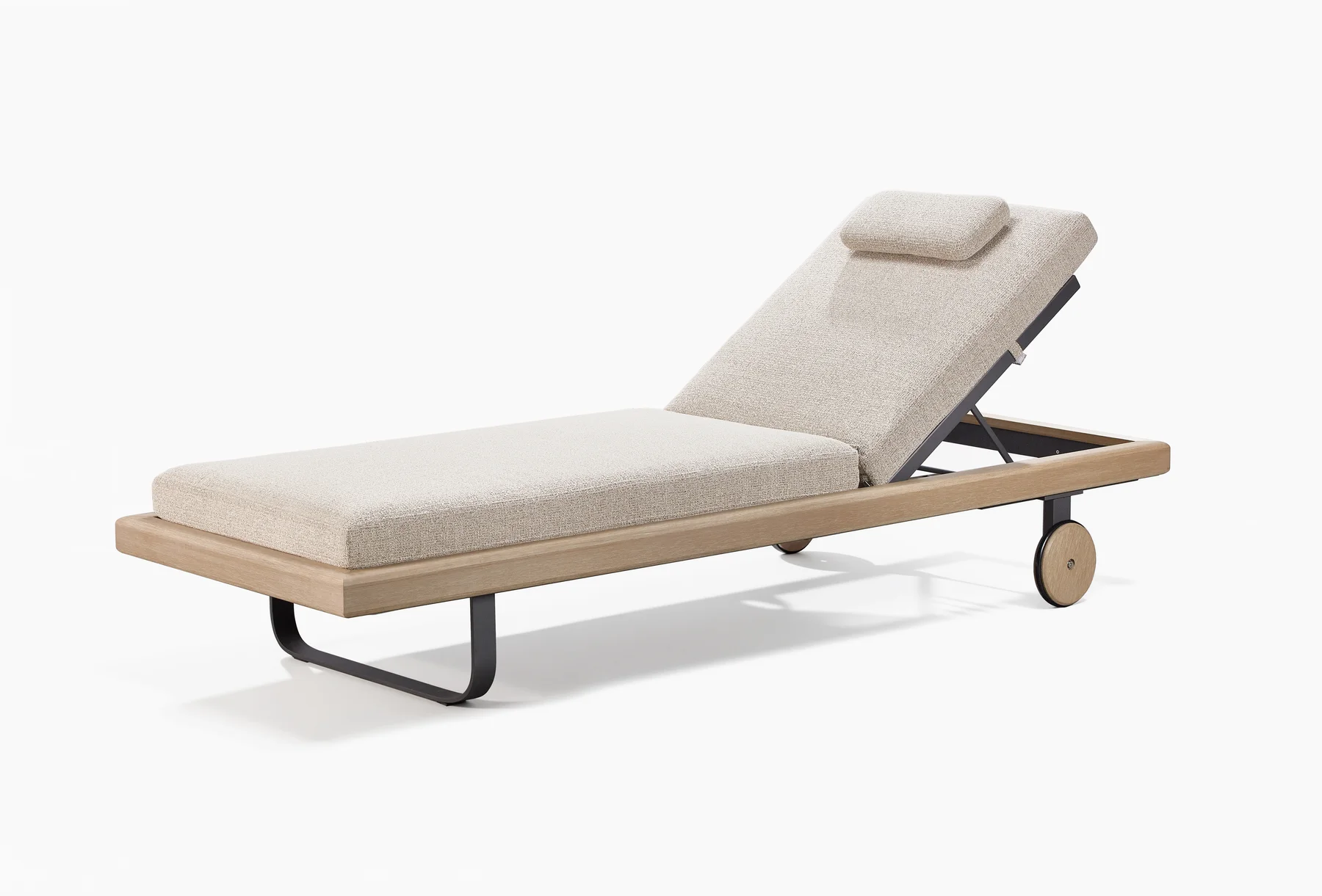
A closer look
A lounger study in proportion, contrast and the space beneath the seat.
The first thing to notice is the line around the lounger. A warm-toned perimeter runs beneath the pale upholstery, turns across the foot and continues towards the raised back. It gives the piece a clear outline even where the cushions change direction.
Below it, the supports are darker and more visually compact. At one end, a curved, loop-like support meets the floor. Towards the other, round wheel faces echo the tone of the outer frame. The upholstery remains the largest quiet surface, while these smaller elements give the silhouette its character.
This study looks closely at the object Sam selected from the Sumparwood image archive. It is an observation of its visible design, not a reconstruction of the steps that produced it. The images can show relationships between parts. They cannot establish material grades, comfort ratings or the performance of a mechanism. Those questions belong to a more detailed development review.
01 / Form notes
Start with the perimeter
The frame reads as a long, shallow boundary. A visible strip remains around the upholstered platform, so the soft surface does not hide the whole outline. That strip becomes particularly clear at the foot, where the front edge turns into the two sides.
Its role in the composition is straightforward: it gathers the long seat and raised back into one object. The backrest changes angle, but the outer line remains a stable visual reference. The lounger can be read as a whole before the eye moves to its supports or cushion edges.
For another design, the useful starting point is this relationship rather than an assumed dimension. How much of the perimeter should remain visible around the upholstery? Should the frame act as a strong outline or sit almost entirely beneath the soft surface? Those decisions would change the character of the piece before any decorative detail was added.
A photograph cannot give the answer for another project. It can make the question more precise. Here, the visible margin is enough to distinguish frame from cushion without turning the perimeter into a broad surrounding platform.
02 / Form notes
Keep the soft surface simple
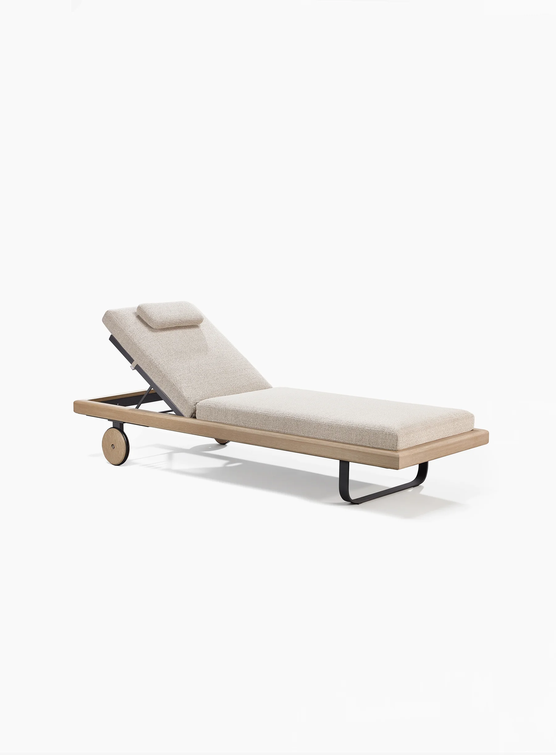
The upholstery has a restrained arrangement. The long lower cushion meets the raised back section, with a smaller head pillow placed near its upper end. Their pale, textured surfaces contrast with the warmer frame and darker supports.
The separation between the lower cushion and back is important visually. It allows the bend in the overall form to remain readable. The upholstery does not appear as one uninterrupted block forced over a change of angle. Each portion has its own outline, while their common colour keeps the composition together.
The pillow introduces a smaller scale within that arrangement. It sits on the larger back surface without becoming a separate visual theme. There is no need for a contrasting colour to identify it: its size, position and shadow are enough.
These are observations about appearance. Soft-looking upholstery is not a measured statement about comfort, and a visible cushion outline does not prove that its cover can be removed. A development brief should ask those questions separately rather than letting the image answer on behalf of the product.
03 / Form notes
Use contrast to explain the parts
Three visual groups are easy to distinguish: the light upholstery, the warm perimeter and the dark elements underneath. This division makes the structure of the image legible. It does not require every component to match.
The darker back support sits behind and below the pale back surface. The front support is also dark, so it belongs visually with the underlying parts rather than with the outer frame. The result is a composition in which the perimeter remains prominent while the supporting pieces can still be seen.
That contrast should not be confused with a materials list. Colour alone cannot tell a reader the alloy, coating or composition of a component. The value of the reference is the relationship between tones and shapes, not an invitation to guess what lies beneath a finish.
For a new piece, a design team could retain this separation while changing the tones. Or it could bring the supports closer to the frame colour for a more unified appearance. The reference offers a decision to explore, not a single correct palette to reproduce.
04 / Form notes
Look at the space beneath
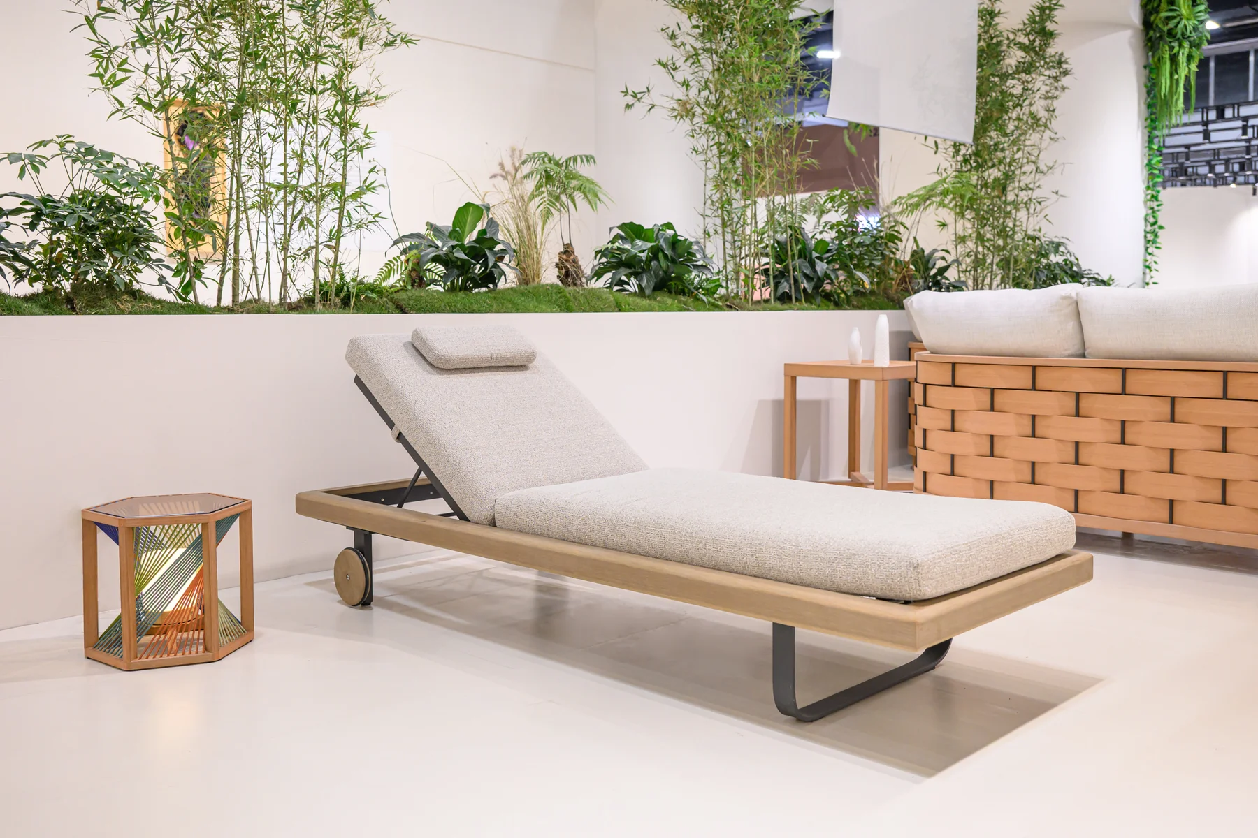
The open area below the platform is part of the silhouette. The long horizontal frame is not carried by a visually continuous base. The front support turns down and curves across near the floor, leaving a clear opening beneath the seat.
This helps distinguish the lounger from a low upholstered block. The eye can follow the outer line, see daylight underneath it and return to the soft surface above. The negative space contributes as much to the reading of the object as the solid parts around it.
The curve of the front support also introduces a different geometry. Above it, the perimeter reads as a long rectangle with softened corners. Below it, the dark support bends in a broader sweep. The two shapes do not repeat each other exactly, but they remain simple enough to sit together.
A physical review would need to consider the support in use, including its contact with the intended surface. None of that can be certified by this view. The image's contribution is to make the visual relationship clear enough for those further questions to be asked about the right part.
05 / Form notes
Let the back change the outline
The raised back is the strongest diagonal in the composition. It breaks the long horizontal line without erasing it. The open space behind the back allows the viewer to see that the upholstered surface and perimeter are separate elements.
From the opposite-side image, the same relationship remains readable. That second view is useful because a single attractive angle can hide how a piece is composed. Here, the long frame, lower cushion, raised back and support can be followed from both sides.
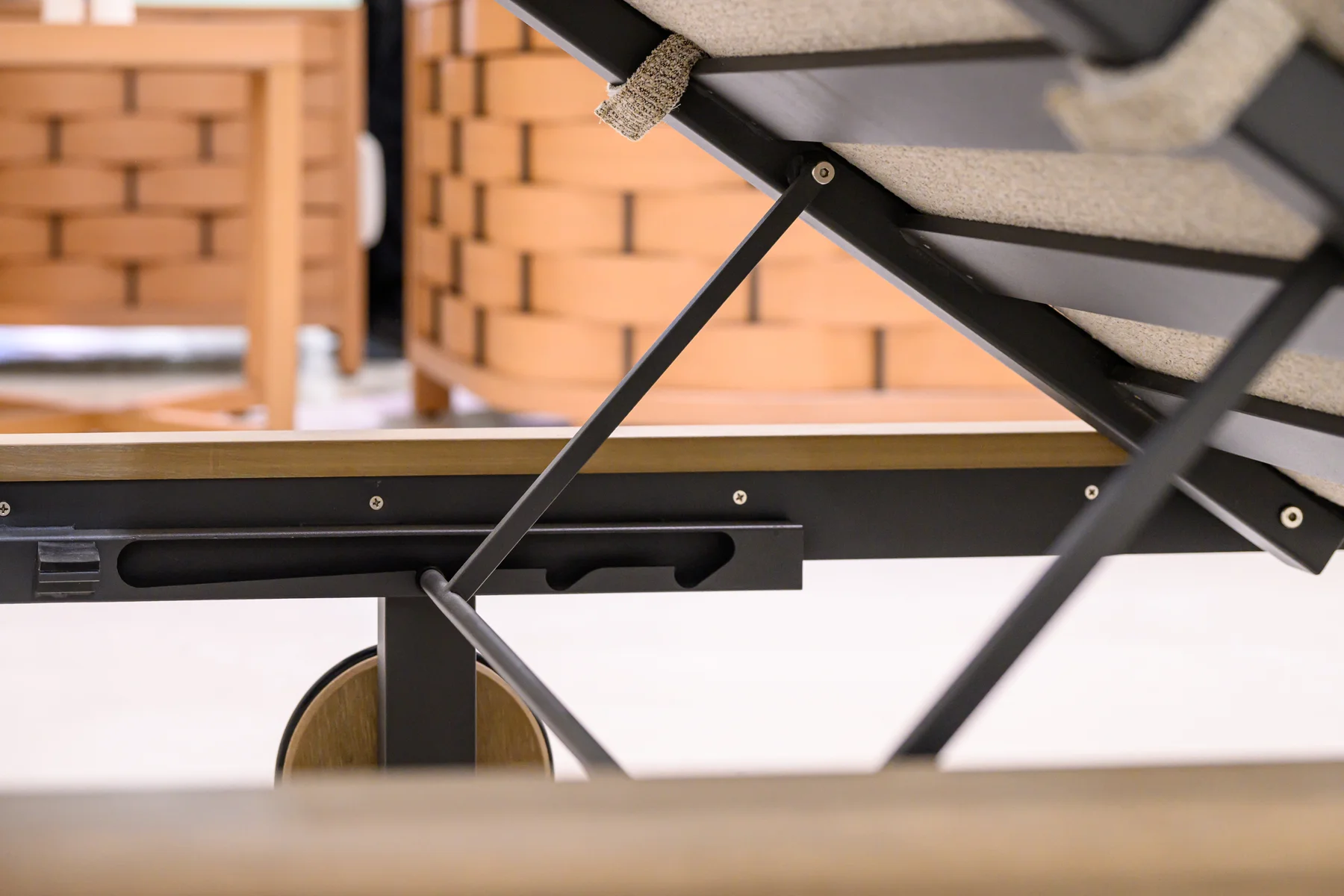
The images show one raised configuration. They do not establish a complete range of movement, the number of available positions or instructions for operating the mechanism. Even where a support is visible, its safe use needs the maker's actual information.
For a development conversation, this creates a useful distinction between a desired appearance and a functional requirement. “A raised back with a quiet silhouette” is a visual intention. The positions, operation and verification needed for a finished design are separate requirements. Both should appear in a brief, but one should not be mistaken for proof of the other.
06 / Form notes
Make the wheel part of the composition
The visible wheel has a warm-toned circular face and a darker outer edge. Its colour connects it to the perimeter, while its round form contrasts with the long lines above. It is a small element with a clear place in the composition.
Seen near the rear, the wheel also changes the visual balance between the two ends. The front has the dark curved support. The rear has the circular element beside the raised back. The lounger does not depend on identical supports to feel coherent.
That is a useful idea to carry into another design: a functional detail can belong to the visual language without being disguised. Its shape may remain distinct while its tone or scale links it to the whole.
However, the presence of wheels does not by itself establish how easily or safely a particular person can move the furniture. Weight, handling method and floor conditions are not visible here. A future product brief would need those requirements expressed directly rather than described with an unsupported promise of effortless movement.
07 / Form notes
Read the joins without inventing them
The outer frame turns at the corners. The cushion sits above it. The darker support meets the underside. These visible meeting points are worth studying because they determine how one part gives way to another.
The photographs do not expose every joint. It would be misleading to name a hidden fastening method or claim a particular manufacturing technique from the finished silhouette. A useful design discussion can still begin with what is visible: the continuity of the outline, the amount of edge left exposed, and the contrast between adjacent surfaces.
This keeps the reference open to development. A team may want the same calm transition between cushion and frame while needing a different construction for its own project. Naming the visible intention gives a development partner something to resolve without requiring an unseen joint to be copied.
The same principle applies to the finish. A warm appearance can be discussed as part of the proposed composition. Exact material and finish references should be established using the appropriate samples and records, not inferred from a photograph's lighting.
08 / Form notes
Carry a relationship into the next brief
An effective reference discussion can be organised around four observations from this piece: a continuous perimeter, a simple upholstered arrangement, contrasting supports and a wheel that belongs visually to the frame. This is an editorial reading, not the maker's recorded design brief.
For each observation, write what your next design should retain and what may change. The perimeter might remain important while its proportions change. The dark supports might be retained as a contrast, but their shape could be different. The upholstery might need a different arrangement for the intended setting.
Then list the questions the image leaves unanswered: overall dimensions, material references, cushion construction, operation, handling and the evidence needed for the intended use. This separates the idea worth developing from the facts still to be established.
The outcome should be a more specific conversation, not a claim that a finished photograph is a complete production specification. The strongest part of this lounger as a reference is how clearly its few visual elements work together. A new design can learn from that clarity without repeating every detail.
09 / Form notes
Begin with the part that interests you
You may be drawn to the long frame, the soft surface or the contrast between them. Start there. A marked-up image and a short explanation of the relationship you want to explore can give a development discussion a useful focus.
See the material palette, explore design development, or request the complete Sample Box. The aim is to develop your next idea with clearer references, not to turn this study into a fixed furniture catalogue.