Material study / The complete Sample Box
Four Finishes, One Place to Begin
A material conversation begins with something you can hold.
Read the study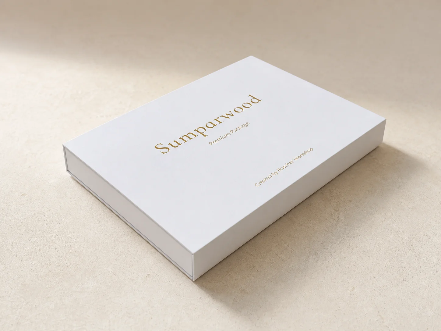
A closer look
A study of the Sumparwood Sample Box and the small decisions that make a material easier to discuss.
A closed box offers very little information about a material. It gives an impression of scale, care and identity, but the important encounter happens when it opens. A sample can be lifted, turned and placed beside another surface. Its edge becomes visible. Its colour can be considered alongside the other finishes rather than remembered from a screen.
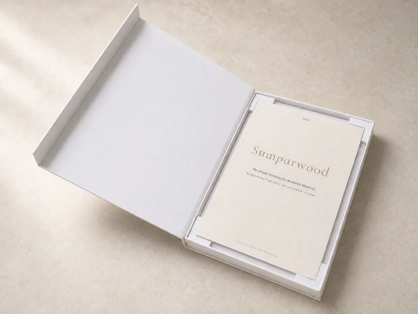
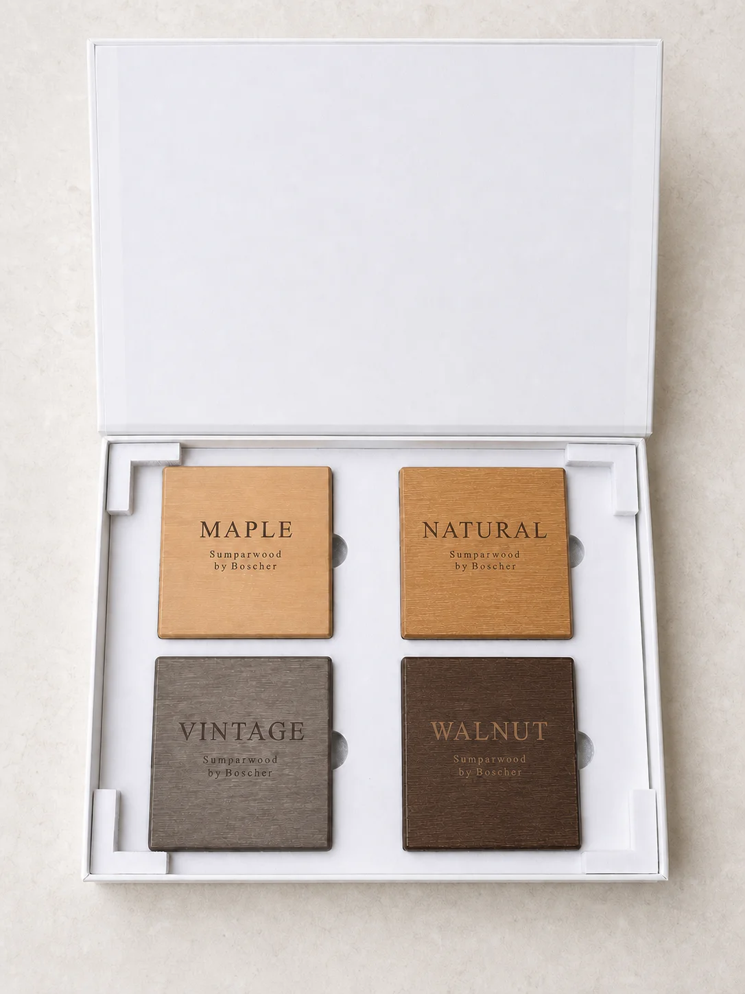
The Sumparwood Sample Box brings four finish references together with the 2026 Lookbook. It is a complete material study, not a set assembled by selecting individual colours. That distinction shaped the way the box was presented online: show the whole set, explain its purpose and make the next conversation clear.
This case follows the presentation of that existing object. It does not reconstruct the manufacture of its packaging or claim that a sample settles every question about a finished piece of furniture. Its subject is more specific: how to give a designer a useful starting point without asking the image to do the work of the material.
01 / Material notes
Keep the four finishes together
The first decision was about the unit being offered. The July 2026 presentation brief defined one package containing the four sample boards, a booklet, a presentation box and its fitted insert. Visitors were not being asked to compose their own assortment. The complete set was the subject.
That has a practical consequence for the story. A single finish can be attractive in isolation, but it does not show its relationship to the other choices. Placing the references together gives a design team a shared comparison. A preference can be expressed as a relationship: lighter than this one, quieter beside that fabric, or closer to the tone already present in the project.
The current finish names are Natural, Vintage, Black Walnut and Maple. The photographed board marked Walnut belongs to the reference set shown here; the written presentation uses Black Walnut. The wording on the physical object should remain visible and unchanged in its photograph. Editing a label inside an image would remove information rather than clarify it.
These names describe the finish choices in the study. They should not be read as a statement that the samples are made from the corresponding timber species. Questions about composition belong in the material discussion, alongside the information relevant to the intended application.
02 / Material notes
Show the object before explaining it
The presentation brief assigned three separate roles to three views: the closed package, the open box with its booklet, and the four finishes viewed together. Each view answers a different question. What is the object? What accompanies it? Which physical references does it contain?
The closed-box view introduces the package without competing with the samples. The open-booklet view establishes that the printed material is part of the encounter. The four-finish view then becomes the most direct description of the contents. No one image has to explain everything.
This sequence is useful because it separates anticipation from information. A box can be photographed beautifully and still leave the viewer unsure what arrives. Equally, a close detail can reveal texture while concealing the size and arrangement of the set. The views work together when each keeps a clear purpose.
The same discipline applies to a new furniture proposal. An overall view, a material reference and a connection detail are not interchangeable. Showing all three is useful only when the reader understands what each is meant to establish. More pictures do not automatically create a clearer account.
03 / Material notes
Give the material a quiet setting
The July brief selected a warm, restrained photographic setting rather than a busy studio desk or a pure-white catalogue treatment. The aim was to keep attention on the package and its contents. Office clutter could be removed from the presentation image, but the object itself was not to be redesigned.
That boundary matters most in the four-finish view. The brief required the boards' geometry, grain, engraved wording and finish colours to remain intact. A more pleasing picture would not be a better reference if it made the finishes look more alike, changed an edge or replaced a visible texture.
The resulting editorial imagery should therefore be read as a presentation of the set, not as a calibrated colour standard. The digital image introduces the differences. The physical samples remain necessary when a team needs to compare them in its own setting.
For a designer, the useful question is not whether a screen looks sufficiently convincing. It is what still needs to be observed directly. Looking at a sample beside the project's other materials may lead to a different conversation from looking at an isolated image. The box gives that conversation a physical starting point.
04 / Material notes
Let the booklet and samples do different jobs
The Lookbook and the sample boards are complementary, not competing versions of the same information. The booklet provides a place to encounter the brand's material language and furniture imagery. The samples bring the discussion back to the surfaces being considered.
A photograph can suggest a proportion or a relationship between upholstery and frame. A small board cannot demonstrate that whole composition. Conversely, a printed page does not let a visitor turn a sample over or look along its edge. Keeping both in the study makes their different roles easier to understand.
This is also where the limits of the box become useful. A sample does not establish the load capacity of a proposed chair. It does not verify a joint, demonstrate an adjustment mechanism or provide a complete account of outdoor performance. Those questions need the relevant design information and evidence for the proposed furniture.
The box is not less useful because it has limits. It becomes more useful when the limits are clear. It can help a team decide what to investigate next, without presenting an early material preference as a finished specification.
05 / Material notes
Replace internal explanation with useful answers
A later presentation decision, documented on 27 July, made the public story more direct. A section explaining internal choices was to be replaced with a material-study section answering three visitor questions: what will I receive, why is it useful, and what happens after a request?
The change did not require a new package or additional objects inside it. It required a better account of the existing one. The proposed section put the opened box beside a short explanation, named the four finishes and the Lookbook, and separated the request process from the material description.
There is a broader design lesson here. A team often has many good reasons for making a decision. A visitor does not need all of those reasons at the point of use. The more important task is to make the consequence understandable. In this case, the consequence was simple: the finishes arrive as one complete study, and dispatch is personally confirmed rather than implied by a picture.
This is a documented presentation decision, not evidence of increased enquiries or a faster sales process. No conversion result is claimed. Clarity was the design objective; measurable business outcomes require their own records.
06 / Material notes
Preserve the whole set on a small screen
The physical object also imposed a requirement on the page: do not crop away the very contents the text is describing. The presentation specification called for the complete set to remain visible on mobile, with the image preceding the supporting copy.
That requirement makes the relationship between image and layout concrete. A dramatic crop might make a box feel larger, but it would be a poor way to explain four included samples if one disappeared outside the frame. Here, completeness is more valuable than visual surprise.
A September layout repair documented another part of that responsibility. A shared styling name had caused the Sample Box section to compress incorrectly. The repair separated the conflicting styles and recorded desktop and mobile checks. The lesson is not about a particular line of code. It is that the intended reading order must survive the actual page.
The record establishes a correction to presentation, not a redesign of the physical box. Keeping that distinction protects the case from becoming a more elaborate development story than the evidence supports.
07 / Material notes
A small record for the next conversation
A team using the box can make its discussion more specific with a short material-review note. This is an editorial suggestion, not a supplied certification form or a claim about how every recipient uses the set.
Record the finish being considered, the part of the furniture where it may be used, the other materials placed beside it, and the question that remains open. Add the date and identify the physical reference used. A photograph may accompany the note, but should not replace the reference itself.
For example, a team might be comparing a frame finish beside a pale upholstery sample. The useful outcome is not simply “we like this colour.” It is a clearer next question: should the frame remain visually distinct from the fabric, or should the two read as a closer tonal pair? That is a design intention a development discussion can work with.
Other questions will concern dimensions, construction or evidence. Those belong in the next brief. The sample review helps locate them; it does not answer them automatically.
08 / Material notes
From a reference to a piece of furniture
The complete Sample Box is most valuable as a beginning. It gives a team several physical references to compare and a common vocabulary for the conversation that follows. Its presentation works when it makes those references clear, preserves their differences and does not promise more than they can establish.
The next step can be modest: a drawing, an intended use, a finish preference and a specific unresolved detail. Together, those give a development partner more to respond to than a mood image alone.
Explore the four finishes, read about design development, or request the complete Sample Box. Bring the material question you want to answer, not just the colour you hope to see.