20 September 2026
Broad Bands,
Quiet Frame.
A chair study in line, space
and the soft volume between them.
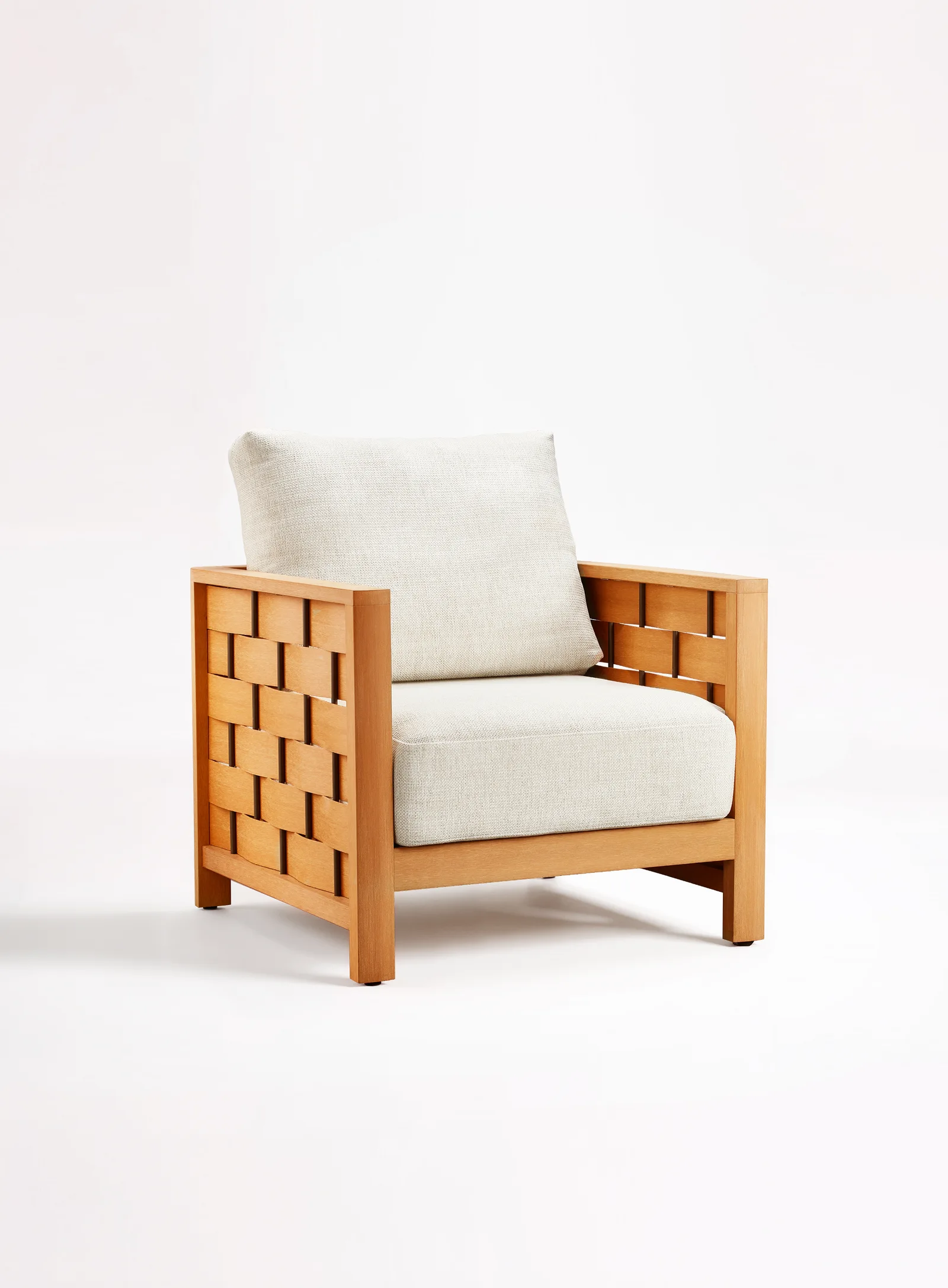
The side of this chair is worth a second look. Broad, warm-toned bands cross a set of darker vertical lines. Small openings sit between them. Around the panel, a simple frame gives the whole arrangement a clear edge.
Inside that outline, the cushions are pale and full. The two parts do not try to look alike. One gives the eye a repeated pattern. The other offers a quieter surface. Together, they give this study its character.
This is a close reading of the piece shown, not a record of every step that made it. The photographs let us discuss its visible design choices. They do not reveal its hidden connections or establish how the bands were formed. That distinction leaves room for a useful conversation: what could a designer take from the idea, without simply taking the chair?
Start at the side
In the front view, the side panels remain prominent. They are not background surfaces waiting to disappear behind the seat. Their pattern sits beside the cushion and gives the chair a second point of interest.
The bands are broad enough to read as individual elements. The narrow openings keep them separate. Seen together, the light surfaces and dark gaps create a repeated movement across the panel. It has a woven appearance, but appearance alone is not a description of the making process.
For another design, this distinction matters. A reference image might communicate a crossing pattern, a certain scale or an open surface. Those are three different intentions. Naming the one that matters prevents a useful reference from becoming a request to reproduce every visible detail.
Here, the panel provides a clear subject for discussion. Does your team respond to the width of the bands, the small spaces between them, or the contrast with the soft seat? The next design could retain one of those relationships and change the others.
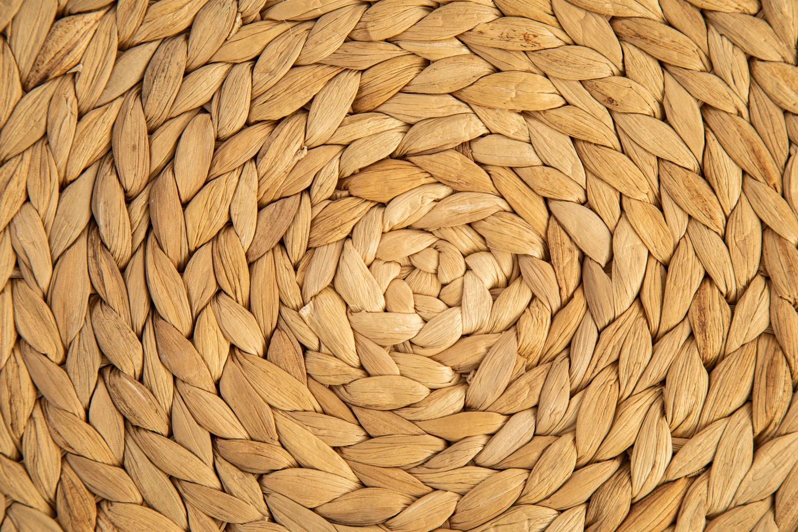
A pattern can be a reference.
It need not be an origin story.
Give the pattern somewhere to finish
The outer frame is quieter than the panel inside it. Uprights define the corners. A horizontal line runs along the top. Another member sits below the seat. These straight elements give the repeated bands a place to begin and end.
That boundary is part of the design, not just an outline around decoration. Without looking into hidden construction, we can see how it gathers the smaller elements into one readable shape. The eye can follow the whole chair before returning to its details.
A design team exploring a related idea could consider how much of that boundary should remain visible. A more prominent frame would give a different emphasis from a panel that visually dominates its surroundings. Neither direction is automatically better. The question is which relationship supports the intended piece.
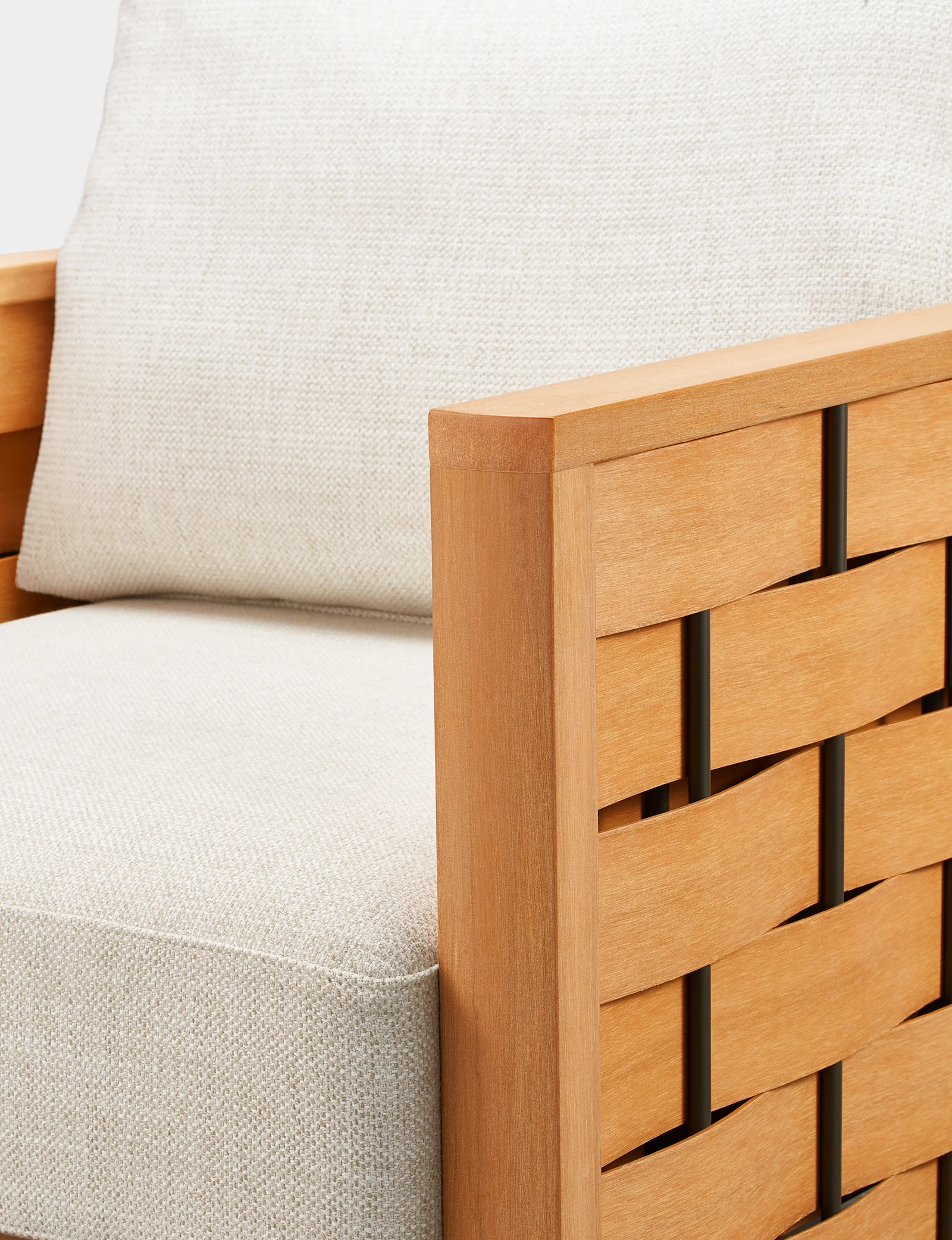
The detail photograph is useful here. It brings the top rail, upright and first bands into the same view. It shows the visible junction, not an internal joint specification. That is enough to discuss the line your team wants to preserve before asking how a new arrangement might be developed.
The band.
The gap.
The boundary.
Leave room for the gaps
The openings contribute as much to the reading as the bands. They break up the surface and bring shadow into the pattern. A solid panel of the same overall size would have a different visual weight, even before its material or finish changed.
This is a visual observation, not a claim about drainage, ventilation or structural performance. Those questions would need their own design information and evidence. It is important not to turn a dark space in a photograph into a technical promise.
For a new drawing, treat the gaps as deliberate shapes. Look at where they begin, how they repeat and how they meet the outer frame. A small opening beside an upright may read differently from an opening in the middle of the panel.
If your team explores a different spacing, mark it as a proposal. The photograph is a reference for the discussion, not proof that another spacing has already been made or tested. Keeping proposals separate from observed details makes the exchange clearer for everyone involved.
Let the cushion change the pace
The broad seat cushion and loose-looking back cushion introduce a different rhythm. Their pale texture does not repeat the band pattern. Their rounded surfaces sit against the straighter frame, making the contrast easy to read.
From the front, the soft volume occupies much of the chair. From the side, the frame and panel become more visible. The character depends on both readings. It is not fully explained by a close-up of the pattern, or by a cushion photograph on its own.
There is no need to infer comfort, removability or fabric performance from this view. A photograph can show volume and texture without answering those questions. The fabric brand, filling and care instructions are not identified in this study.
For your own design, consider what happens when the soft part and the frame compete for attention. Would a busier textile distract from the bands? Would a stronger colour contrast make the panel feel more separate? These are directions to explore with physical references, not recommendations for an untested finished assembly.
A softer
counterpoint.
Read the palette as a relationship
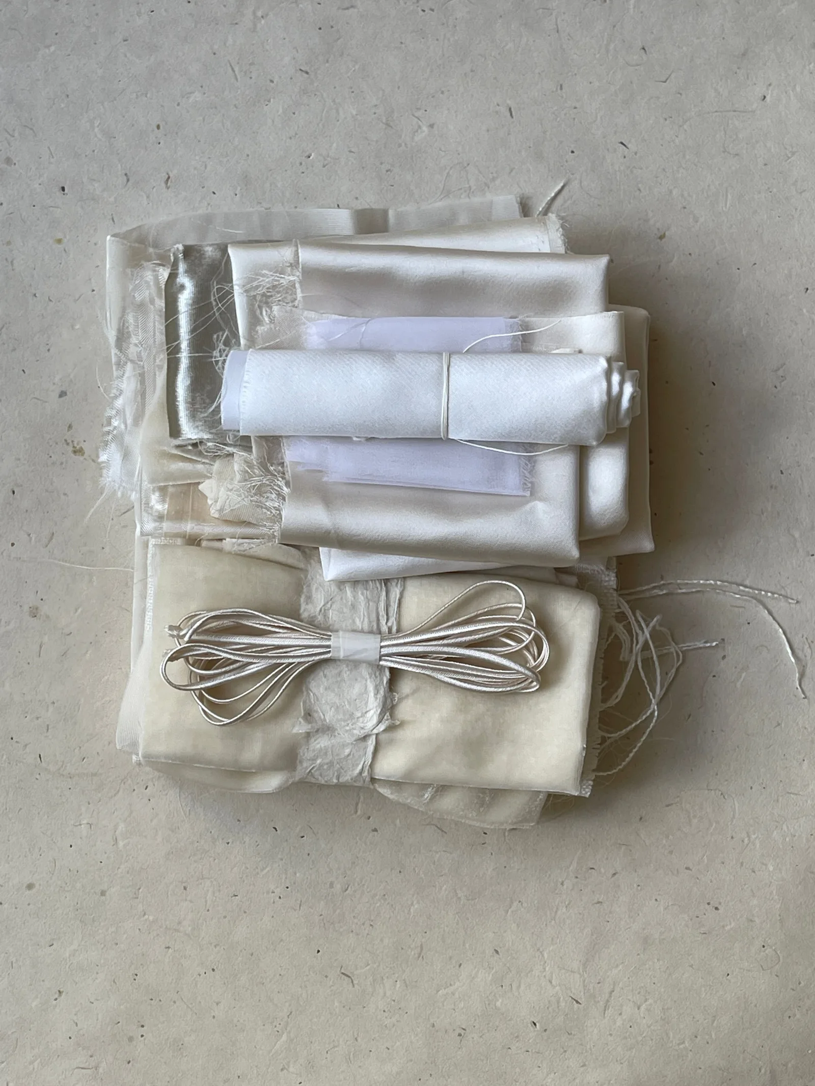
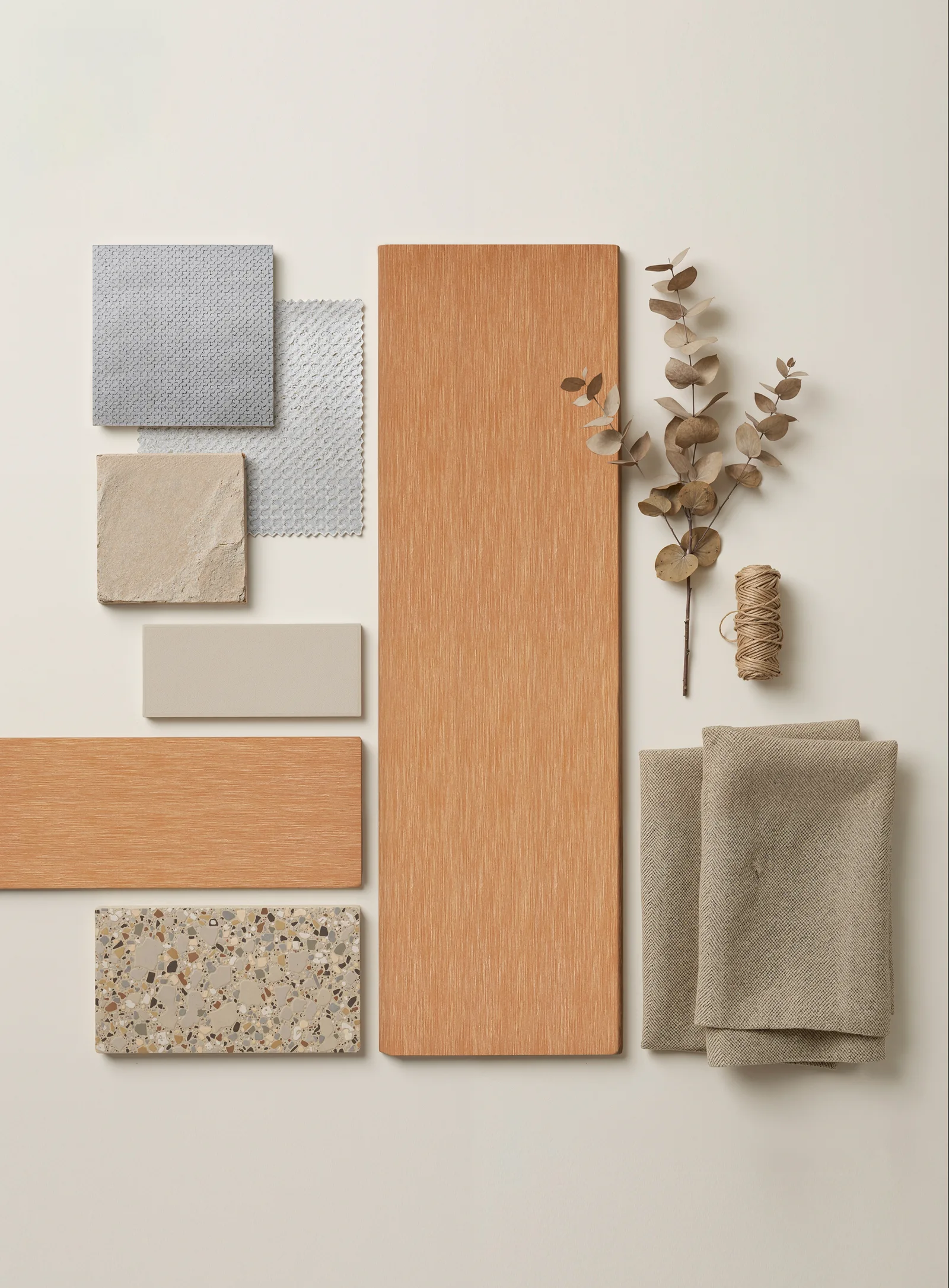
The accompanying palette composition places warm-toned material references beside light fabrics, smooth surfaces, a speckled reference and a dried branch. It offers a wider view of colour and texture around the chair's visual language.
It is not a bill of materials. The branch does not establish where the design began, and the separate samples do not identify every component of the chair. Their useful role here is to make relationships visible: warm beside cool, quiet beside textured, regular beside irregular.
The warm reference occupies a large part of the composition. Smaller, paler pieces sit around it. That difference in area matters to the impression. A tiny colour sample and a broad chair panel do not have the same visual presence, even when the intended tone is similar.
Use the Sumparwood palette to open a colour discussion, then look at physical samples with the other materials your project will use. The screen is a starting point. It should not become the final authority for a colour decision.
Colour is also
a relationship.
A pattern is not a process record
The alternating bands invite questions about making. How are they supported? How are their ends resolved? Which dimensions are fixed, and which might be open to development? Those are sensible questions, but the images supplied for this study do not answer them.
We have therefore kept the account with what can be seen. It does not attribute the panel to hand weaving, a particular mould, a forming temperature or an unseen fastening system. It does not assign a development date or invent a sequence of prototypes.
This makes the study more useful as a first reference. A designer can separate the visual intention from the technical questions still to resolve. The workshop is the place to begin that more specific discussion, with a drawing and a clear description of the intended application.
An outdoor furniture brief would also need to address the complete assembly and its intended conditions. A compelling pattern does not replace that work. The design reference and the evidence required for a project serve different purposes.
Use a three-distance reading
Before taking a detail into another design, read the reference at three distances. This short exercise helps separate the overall idea from the parts that happen to accompany it.
Across the room: describe the outline in one sentence. In this view, a clear upright frame surrounds a generous pale seat. Keep the sentence about shape and visual balance, not assumed performance.
Beside the chair: name the relationship that attracts you. Here, broad bands and small openings sit beside a quieter upholstered volume. Decide which part of that relationship is essential to your own idea.
At the edge: point to one place that needs a closer conversation. It might be the end of a band, the top rail or the meeting between panel and upright. Mark what is visible and what still needs an explanation.
Put these three observations beside your drawing. They are not an approval checklist. They are a way to explain why a reference matters, so a development conversation can move beyond “something like this”.
Take the relationship, not the whole piece
This study does not need to become a collection that another designer follows. Its value may lie in one small relationship: a repeated surface held inside a quiet boundary, or a warm frame beside a pale soft volume.
Another design could begin with a different outline and still explore that relationship. A proposal might change the panel's scale, position or visual emphasis. It would then need to be considered on its own terms, rather than treated as a proven variation of the photographed chair.
That is how we want these studies to be used. They make an idea concrete enough to question. Your team brings its own design direction; the reference helps identify what to discuss, not what the final piece must become.
Explore the material or request a Sample Box to begin a physical review. Include a short note about the detail that caught your eye and the piece you are developing.
One pattern can start a conversation. The next shape can be your own.